I kept buying purple pillows that clashed with my gray walls until I figured out the tone difference. Switching to muted lavender accents and charcoal bedding fixed the whole space, and it only cost an extra $65 to replace two items.
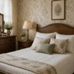
This guide focuses on a modern purple and gray bedroom using soft, muted tones rather than bright jewel shades. Budget runs $250–400 from scratch. It works best in bedrooms where you want calm without going fully neutral. The current trend leans toward matte finishes and texture mixing in these colors.
What You’ll Need for This Look
Foundation Pieces:
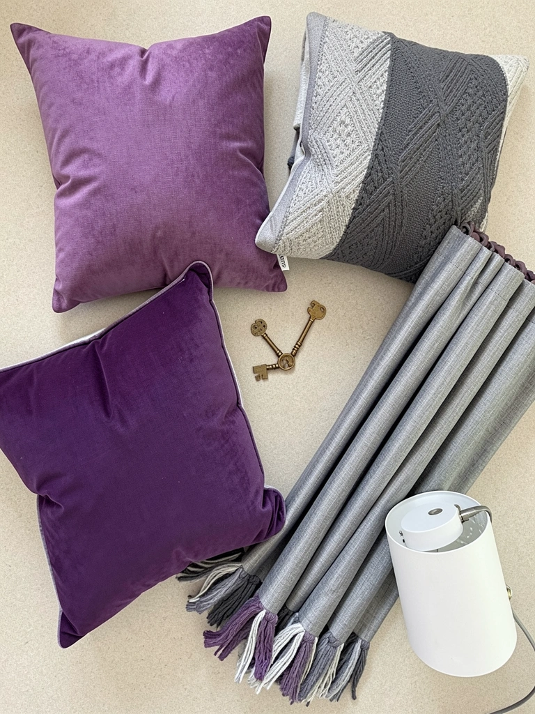
- Gray linen curtains, 96-inch (~$40-55 per panel)
- 8×10 charcoal area rug (~$130-180)
Textiles & Layers:
- Purple velvet euro pillows, set of 2 (~$45-65)
- Gray comforter set, queen (~$80-120)
- Muted lavender throw blanket (~$35-50)
Lighting:
- Gray table lamp with linen shade (~$50-75)
Finishing Touches:
- Gray storage baskets, set of 2 (~$30-45)
- Purple accent vase set (~$25-40)
Budget-Friendly Swaps:
- Use gray quilted coverlet instead of a full comforter set to cut costs in half.
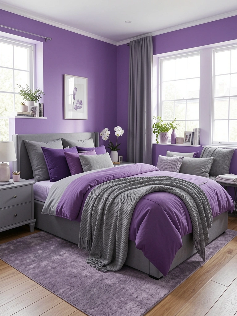
Anchor the Room with Gray Foundations
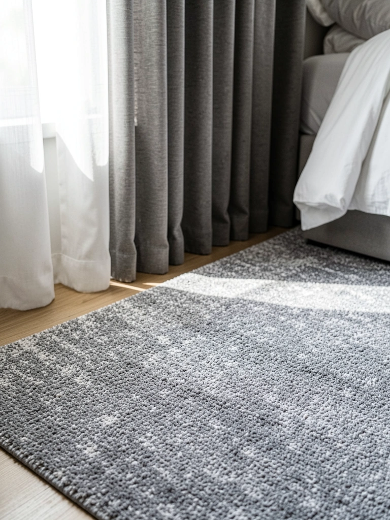
I started with the gray base because purple needs something to rest against. I used an 8×10 charcoal area rug so the bed frame sits fully on it. This anchors the space and keeps the gray from floating. The rug color is a medium charcoal that doesn’t compete with the walls.
For the windows, I hung gray linen curtains from the ceiling line rather than the window frame. This adds height and keeps the gray running vertically. The panels puddle just slightly on the rug.
One early mistake I made was choosing curtains that were too light a gray. They washed out against my wall color, so I swapped them for this deeper shade.
Layer Muted Purple for Visual Interest
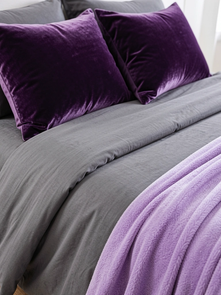
Once the gray base was set, I added purple on the bed only. I placed two purple velvet euro pillows behind standard sleeping pillows. The velvet catches light differently than the matte gray comforter, which prevents the purple from looking flat. I draped a muted lavender throw blanket across the foot of the bed so the purple appears twice without dominating.
The visual principle here is limited repeats. Purple shows up on the pillows and throw only. Everything else stays gray. I tried adding a third purple item early on and the room immediately felt busy, so I removed it.
Finish with Neutral Accessories and Lighting
I finished the space with two small touches. A single gray table lamp on the nightstand keeps the lighting warm and softens any harshness from the purple. Two gray storage baskets sit under a bench to hide clutter without adding more color. This keeps the palette balanced and the room calm at night.
Common Styling Mistakes to Avoid
Mistake 1 – Using bright saturated purple against light gray
Why it doesn’t work: The contrast feels jarring and cheapens the palette.
Do this instead: Choose muted or dusty purple tones like lavender or eggplant. The purple velvet euro pillows I linked stay in that softer range.
Mistake 2 – Adding purple in every corner
Why it doesn’t work: The color loses impact and the room feels chaotic.
Do this instead: Repeat purple no more than twice. Everything else stays gray.
Mistake 3 – Choosing curtains that match the wall exactly
Why it doesn’t work: You lose the vertical line that makes the room feel taller.
Do this instead: Pick a gray one shade deeper than the walls for subtle definition.
Shopping Guide: Where to Find These Items
Stick to matte finishes for purple pieces: Glossy purple reads dated fast. Look for velvet or linen-blend options like the purple velvet euro pillows.
Buy the rug first: Gray rugs set the scale for everything else. Measure your bed frame before ordering so the front legs sit on it rather than around it.
Use baskets instead of more decor: Extra purple accents risk overdoing the look. Gray woven storage baskets hide things while keeping the palette quiet.
Test purple samples on your actual bed: Lighting changes how the color reads. Order two different shades if needed and return the one that fights your gray.
The rug is the one piece I always buy before touching anything purple. Once that gray base is down, the rest falls into place quickly. Which gray tone are you starting with on your walls or bedding right now?