

Choosing a kitchen colour feels harder than it should because so many things compete—light, counters, cabinets, and your daily habits. This guide breaks the process into simple, practical choices so you can pick a kitchen room colour that looks good all day and lives well with family life.
How To Choose A Kitchen Room Colour
Start by checking light, fixed finishes, and how the space is used. Work through these steps to narrow choices, test safely, and commit with confidence.
1. Read the light first
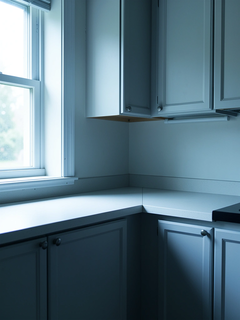
Look at the kitchen at different times of day. North light reads cool and can make warm paints look muted, while south or west light makes colours feel richer; choose warmer tones for north-facing rooms and cooler tones for sunnier aspects. I once picked a warm beige for a north kitchen and had to add a warmer trim to stop the room from feeling flat.
Pay attention to artificial lighting too. LED temperature changes how a colour looks when you cook at night. Try bulbs you’ll actually use while testing samples.
2. Match undertones to fixed finishes
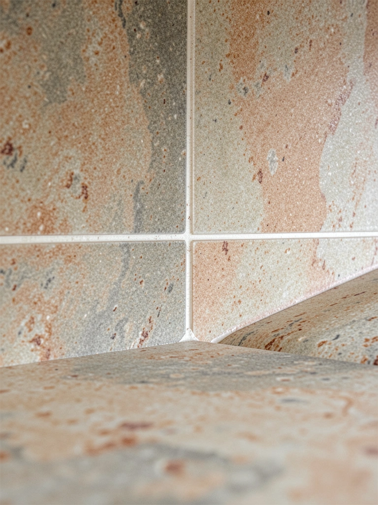
Identify the undertone in countertops, tile, and cabinetry—pink, yellow, blue, or green—and choose a wall colour that harmonizes, not competes. When my granite showed unexpected green veins, swapping to a warm greige pulled everything together without clashing.
Use sample cards next to the actual surfaces rather than relying on swatches alone. It’s the undertone that will make a colour sit right beside tile and wood.
3. Decide how bold you want to be
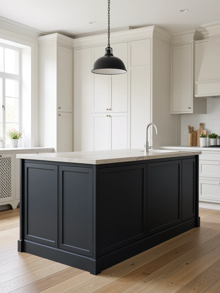
Pick whether walls will fade into the background or act as a supporting player to a bold island, cabinetry, or open shelving. A darker island or accent wall can add depth without committing the whole room. I painted my island two shades darker than the walls and the kitchen suddenly looked layered and intentional.
If you rent or prefer low commitment, focus bold colour on cabinets or accessories rather than full-room paint.
4. Choose the right finish and consider durability
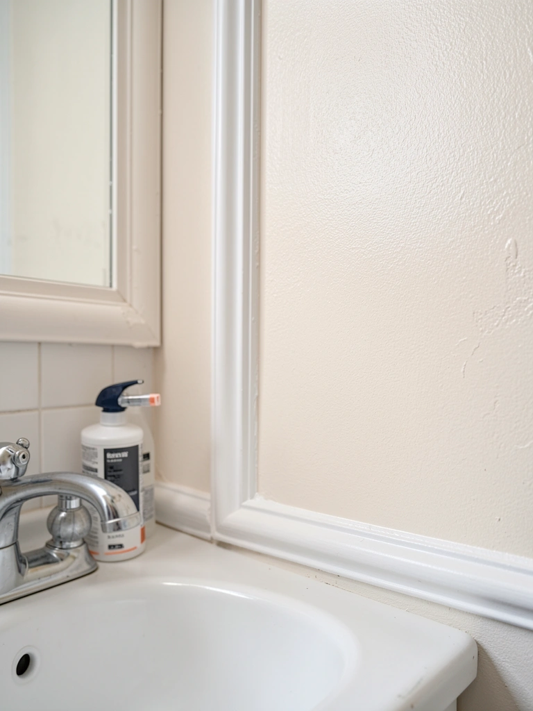
Pick a finish suited to kitchen wear: satin or eggshell for walls that need wiping, semi-gloss for trim and doors because it stands up to scrubbing. Matte can hide imperfections but is harder to clean in high-traffic spots. In my busy family kitchen, eggshell on walls and semi-gloss on trim made maintenance painless and kept the room looking fresh.
Also think about paint quality—better paint often gives fuller coverage and greater stain resistance, which matters in kitchens.
5. Plan trim, ceiling, and transition colours
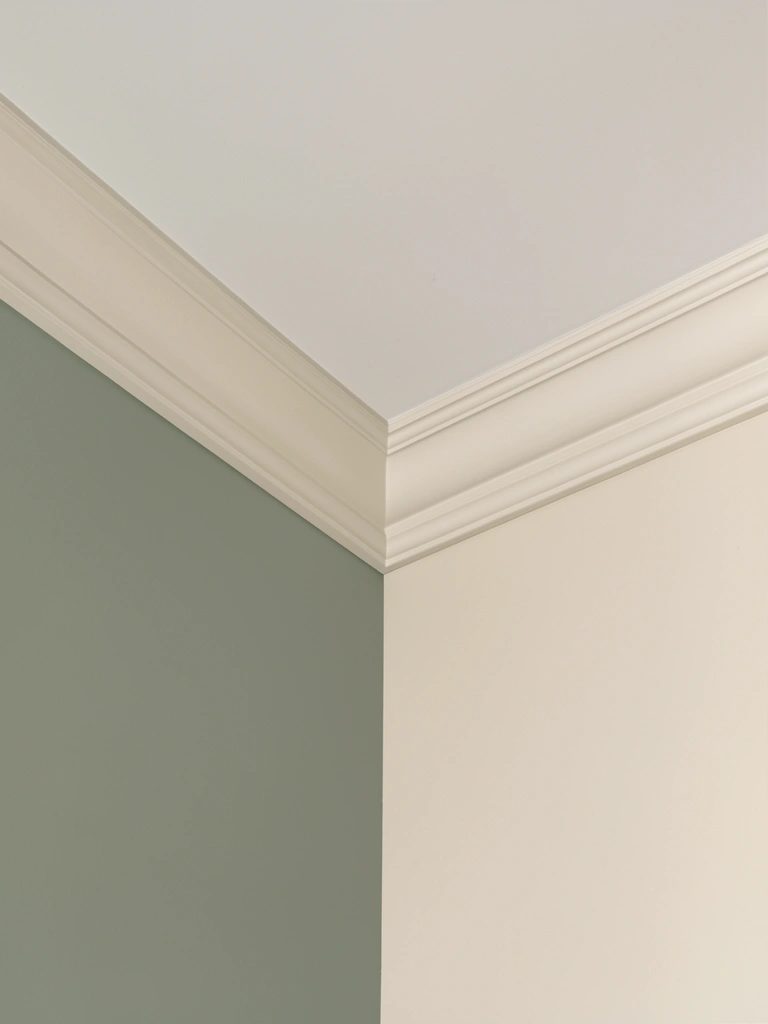
Decide if the ceiling will be bright white, a soft tint, or the same colour as the walls. White ceilings open a low kitchen, while a slightly tinted ceiling can cozy up a tall room. I once painted a high ceiling a soft cream to make a large kitchen feel more intimate without making it darker.
Also select trim and door colours that create smooth transitions into adjacent rooms. A slightly warmer trim can cushion a cool wall tone and keeps sightlines calm.
6. Test in place and live with samples
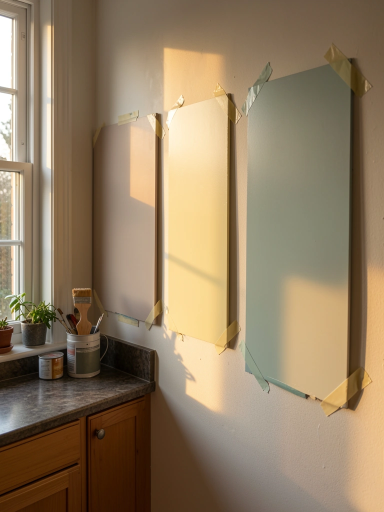
Paint big sample panels and observe them at morning, midday, and evening light. Leave samples up for a week and look at how they read when you cook and when you entertain. I nearly chose a popular grey from a photo until my sample looked muddy at dinner time, so testing saved me from a costly mistake.
Keep notes on what you like and what bothers you. By the time you’re satisfied, you’ll have a clear plan for walls, accents, and finish.
Common Mistakes to Avoid
Mistake: Choosing from a small chip under a single light.
Why it does not work: A tiny swatch does not show how colour shifts with time of day or beside real surfaces.
Do this instead: Paint large sample panels and view them throughout the day. Consider using a paint sample set like Paint Sample POTS set for quick testing.
Mistake: Matching paint solely to a photo or trend.
Why it does not work: Photos and trends ignore your kitchen’s specific light and fixed finishes, so the colour can feel off in person.
Do this instead: Use photos as inspiration but always test in your space.
Mistake: Ignoring sheen and cleanability.
Why it does not work: Flat finishes can stain easily in busy kitchens and show marks that are hard to remove.
Do this instead: Use washable eggshell for walls and semi-gloss for trim and doors; see durable paints by searching washable interior paint.
Final Thoughts
Choosing a kitchen room colour is about balancing light, fixed finishes, and how you want the room to feel and function. My best advice is to test big, live with samples, and decide which surfaces should stand out versus recede. A single darker island or warm trim can make a safe wall colour feel purposeful.
Start with one simple test panel this weekend and observe it at different times. Which wall will you try first and what fixed finish should it coordinate with?
Relevant Articles
