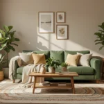

A beige living room can feel safe but flat. This guide shows practical, low-risk ways to add a pop of color so your room feels intentional, welcoming, and balanced without losing that calm, neutral base. I’ll walk you through five focused styling moves that solve the “too beige” problem.
How To Style A Beige Living Room With Pop Of Color
A few targeted changes create a fresh look without a full remodel. Below are step-by-step styling zones you can tackle in order, each adding a clear pop of color.
1. Anchor the sofa with a purposeful accent color
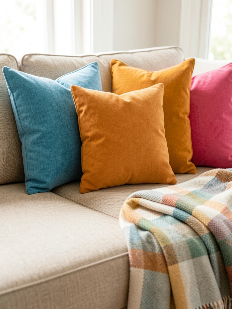
Place 2–3 pillows and one throw in the same accent color family on your sofa so the eye reads them as one decision. This anchors the seating area and gives you a clear color to repeat in smaller accents around the room.
Keep pillow sizes varied for scale: one large lumbar, one medium square, one small textured cushion. A common mistake is matching patterns exactly; instead mix solids, subtle texture, and one small-scale pattern. I often swap pillow covers by season to keep the base neutral while rotating color.
Shop this idea
- Textured Solid Throw Pillow Covers
- Lightweight Decorative Throw Blanket
- Mix-and-Match Pillow Insert Set
2. Use one large artwork to set the color story
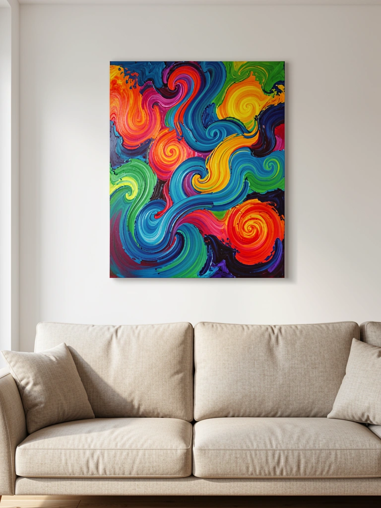
One large piece of art in a bold hue gives the room immediate personality and keeps the beige walls from feeling empty. Hang the piece at eye level above the sofa so it reads as the room’s anchor and repeat the color in pillows or a rug.
Leave about 6 to 10 inches between the top of the sofa and the bottom of the frame for proper scale. Avoid multiple small pieces that compete; a single statement art piece is often more calming beside neutral furniture. I prefer to pick art first, then pull smaller accent colors from it.
Shop this idea
3. Layer a rug and an accent chair for anchored contrast
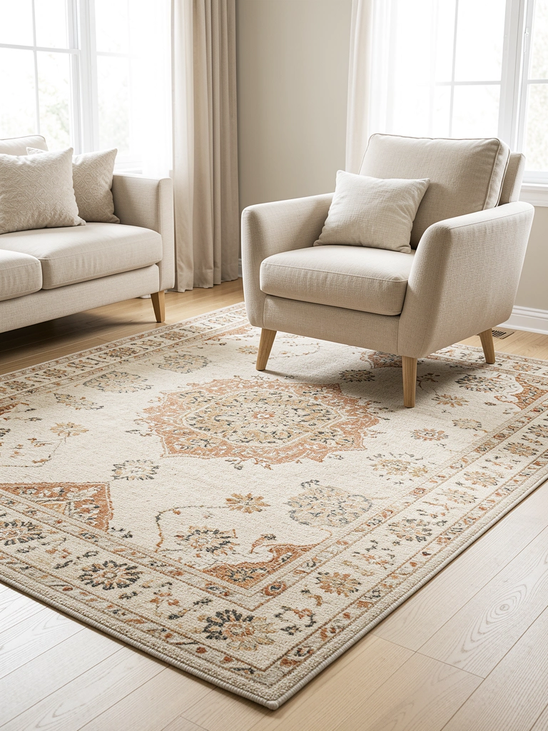
Choose a rug that includes your accent color to tie floor to furniture, and add an accent chair in either the same color or a complementary shade. This creates a visual triangle: sofa, art, and chair, which makes the color feel intentional across levels.
Keep the chair proportionate to the sofa and leave a 12–18 inch flow around the chair so the room reads airy, not crowded. A mistake I see is a loud rug that fights the art; instead pick a rug with a soft pattern that echoes the accent color subtly. In my rooms I often use the chair as a test for how bold I can go.
Shop this idea
4. Add lighting and small metal accents to lift the color
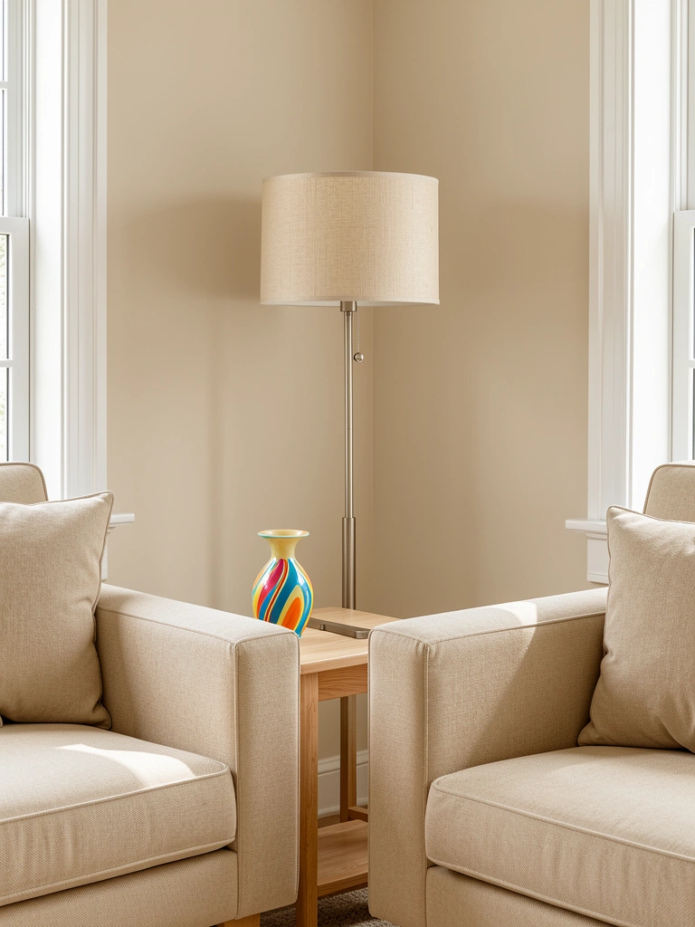
Introduce a lamp with a colored base or a shade that echoes your accent color, and add small metallic accents like brass or matte black to give depth. Light brings color to life and prevents beige from looking flat in the evenings.
Scale lamps to furniture heights: table lamps should hit just above the arm of the sofa. Avoid too many shiny metals that feel cold; a single metal tone keeps the look cohesive. I usually change lamp bulbs to warmer tones to keep the beige cozy.
Shop this idea
5. Finish with curated accessories and plants for playful pops
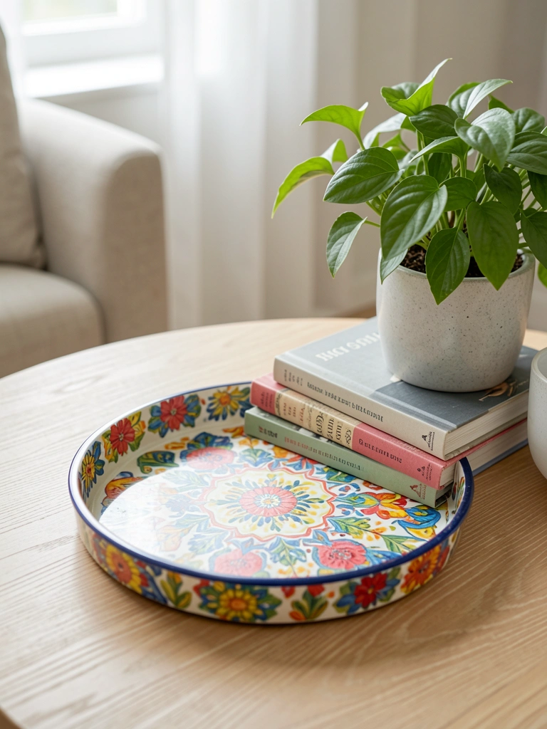
Scatter small accessories in your accent color—vases, trays, or stacked books—so color appears in short, deliberate bursts around the room. Green plants also contrast beautifully with beige and the chosen accent, making the space feel lived-in.
Keep vignettes to three items for balance and vary heights for interest. A common error is over-accessorizing every surface, which dilutes the impact of your chosen color. I like to live with a new grouping for a week before committing so I can see how the color reads in daily light.
Shop this idea
- Decorative Serving Tray in Accent Color
- Set of Styling Books and Coffee Table Books
- Easy-Care Indoor Potted Plant
Common Mistakes to Avoid
Mistake: Using too many different accent colors.
Why it does not work: It makes the room feel confused and undermines the calm beige base.
Do this instead: Pick one main accent color and use it in three places: textiles, art, and one furniture piece. Coordinated Pillow Set
Mistake: Placing small, scattered color items only on one side of the room.
Why it does not work: The room feels unbalanced and visually heavy on one side.
Do this instead: Create a color triangle: sofa pillows, wall art, and a chair or rug.
Mistake: Choosing accent pieces that are too bright or neon.
Why it does not work: They can clash with beige and feel jarring.
Do this instead: Use saturated but slightly muted tones or jewel tones for warmth. Muted Jewel Tone Pillow Covers
Final Thoughts
Start with one clear accent color and use it in three places across the room. That simple rule keeps the space cohesive while letting beige do the heavy lifting as a calming backdrop. My own living room felt instantly more intentional when I moved an art piece above the sofa and matched two pillows to it.
Try one change this weekend: swap pillow covers or hang one new artwork and live with it for a week. Which accent color are you leaning toward for your beige living room with pop of color?
Relevant Articles