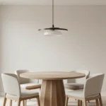

Finding a color scheme that makes an open-plan kitchen and living room feel like one thoughtful space can be confusing. This guide shows practical steps to choose kitchen and living room combo colors that flow, respect natural light, and work with cabinets, countertops, and sofas so your rooms read as a single, comfortable home.
How To Choose Kitchen And Living Room Combo Colors
Start by noticing light, finishes, and how you use both spaces; a few thoughtful tests will save repainting later.
1. Read the room: note light and fixed elements
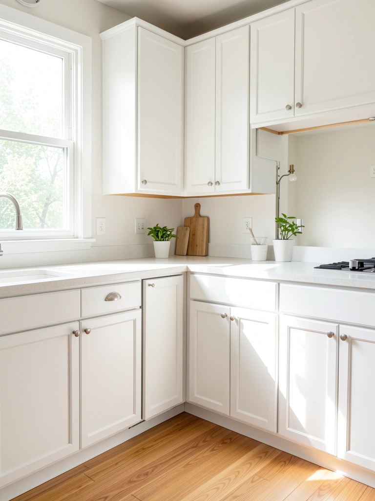
Walk the space at different times of day and make three quick notes: how warm or cool the light is, which finishes are permanent, and which surfaces you can change. Those fixed elements—flooring, major cabinetry, or an accent wall—should steer your palette so nothing fights for attention.
I always find that what felt right in a paint chart looks different in late afternoon light, so test with samples. A small observation: lighter floors forgive more contrast, while darker floors need softer wall choices.
2. Pick a neutral base that connects both areas
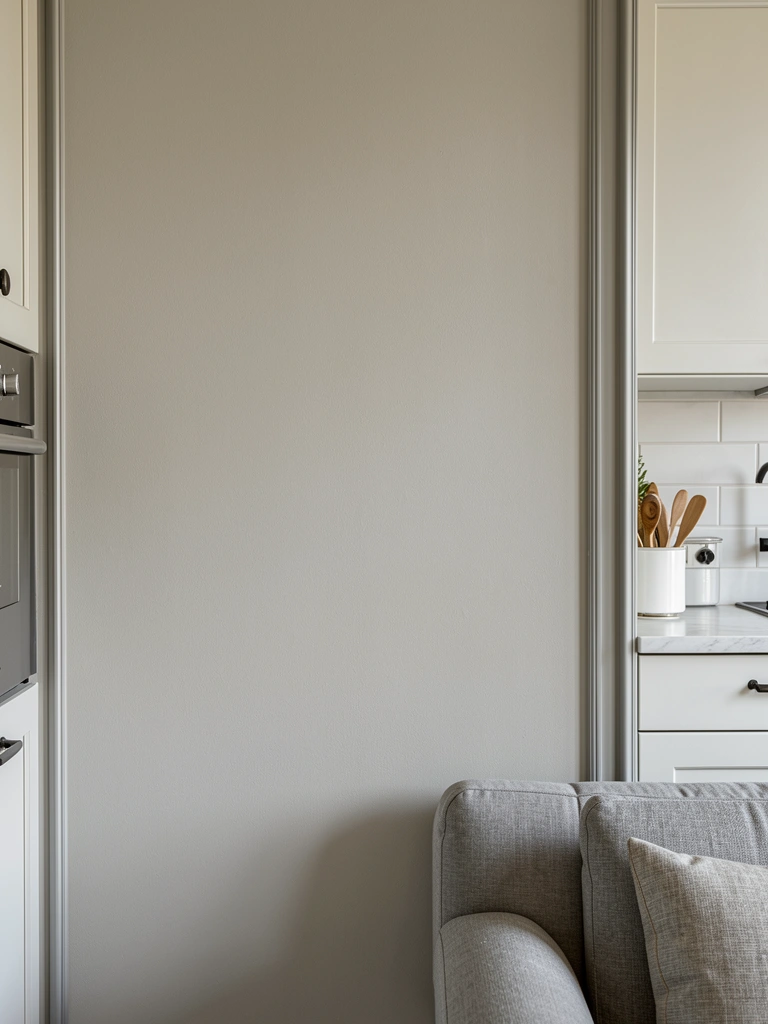
Choose a single neutral for walls and large walkways to visually link the two zones; warm greige, soft white, or a pale greige-green work well depending on your light. Using one base color avoids abrupt shifts and lets you play with more color in furniture and accessories without chaos.
Keep the base slightly warmer or cooler to match your light and major finishes. I prefer a neutral that hides dust and reads slightly warm in the evening so the room never looks washed out.
3. Create a three-color palette: anchor, secondary, and accents
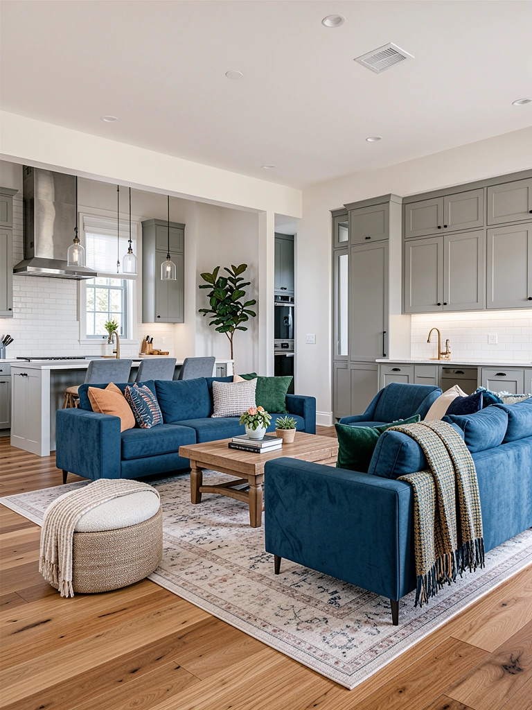
Build a palette with one anchor color (sofa or lower cabinets), one secondary (wall, upper cabinets, or island), and one or two accent colors (pillows, art, or small appliances). When choosing kitchen and living room combo colors this way, you get balance and flexibility without overcommitting to paint in every area.
Aim for contrast without conflict: the anchor should be the strongest visual piece, the secondary supports it, and accents add personality. A practical note from my projects: if your island is the anchor, repeat that hue subtly in the living room to carry the eye.
4. Coordinate finishes and materials, not just paint
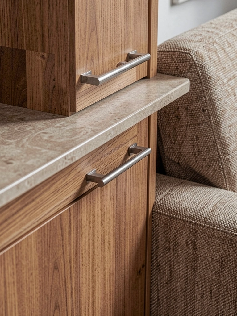
Think beyond paint—stone, wood, metal, and textiles read as color too. A cool quartz countertop can make warm wall paint look muddy, while brass hardware can pull a palette warm. Match undertones: cool greys with cool metals, warm woods with warm paints.
I often layer a textured rug or woven basket that picks up a secondary color; this ties materials together more naturally than matching exact paint chips. Small finishes repeated in both areas make the combo feel intentional.
5. Use transition pieces to bridge deliberate contrasts
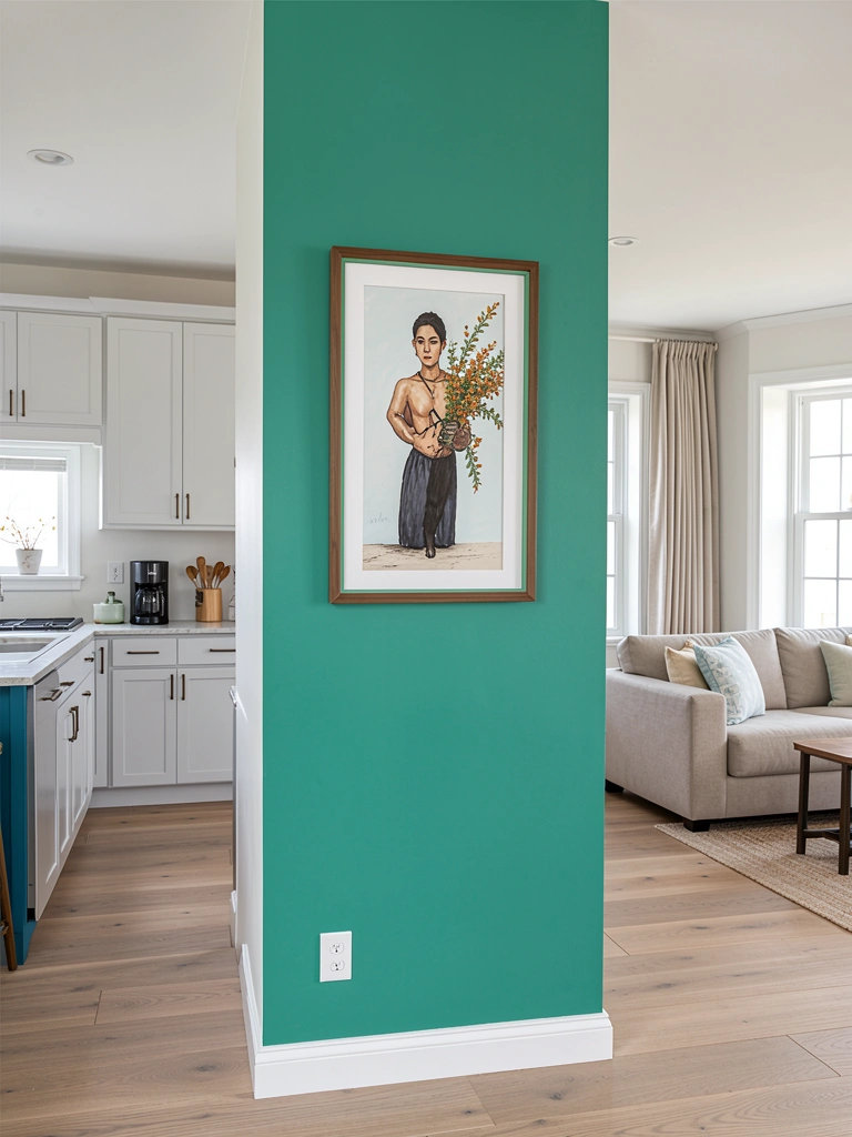
If you want different moods for each area, introduce a transition element: a shared rug color, a bar stool hue repeated in cushions, or a half wall painted in an intermediary tone. These pieces soften the visual cut between two distinct palettes and guide the eye.
Avoid abrupt color changes at sightlines. My experience shows a single repeated color or material every three to four feet is enough to unify the space without making everything match.
6. Test, live with samples, and refine
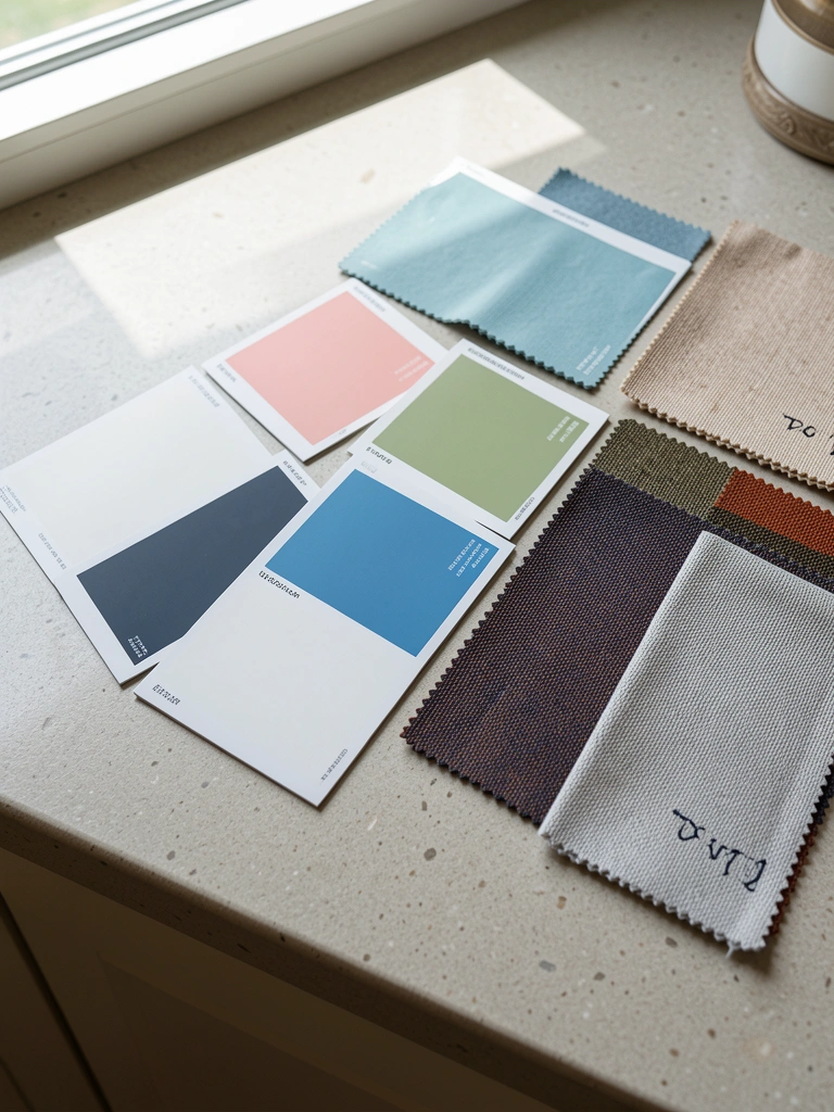
Buy sample pots and paint 12-inch swatches on multiple walls and observe them at different times of day. Place upholstery or curtain swatches beside painted areas to see how fabrics and paint interact. This step prevents costly mistakes.
I always walk away for a day and return; fresh eyes catch clashes I missed initially. If something still feels off, reduce saturation or move the bold color to accessories.
Common Mistakes to Avoid
Mistake: Using too many strong colors across the open plan.
Why it does not work: The space reads cluttered and the eye has no place to rest.
Do this instead: Limit bold hues to one anchor and a few accessories, keeping walls and large surfaces neutral or low-contrast. Consider a sample pack like a paint test kit to experiment first: Paint Sample Kit
Mistake: Matching paint to a tiny chip or online photo.
Why it does not work: Chips don’t show undertone behavior under your light and finishes.
Do this instead: Always test 12-inch swatches on the wall near the furniture and living light.
Mistake: Ignoring permanent finishes when picking color.
Why it does not work: Fixed flooring or countertops can clash with your chosen palette.
Do this instead: Pull undertones from those finishes into your palette and include sample swatches of the materials when testing.
Final Thoughts
Choosing kitchen and living room combo colors is about decisions that support how you use the space and how light reveals color. My best advice is to start with a single neutral base, add one strong anchor, and then introduce accents thoughtfully to guide the eye between zones.
Try one small change this weekend: paint a trim, swap cushion covers, or test a single wall. Which surface would you like to change first to create a smoother color flow between your kitchen and living room?
Relevant Articles
- kitchen and living room combo small area
- kitchen and living room combo apartment
- boho home decor living room